
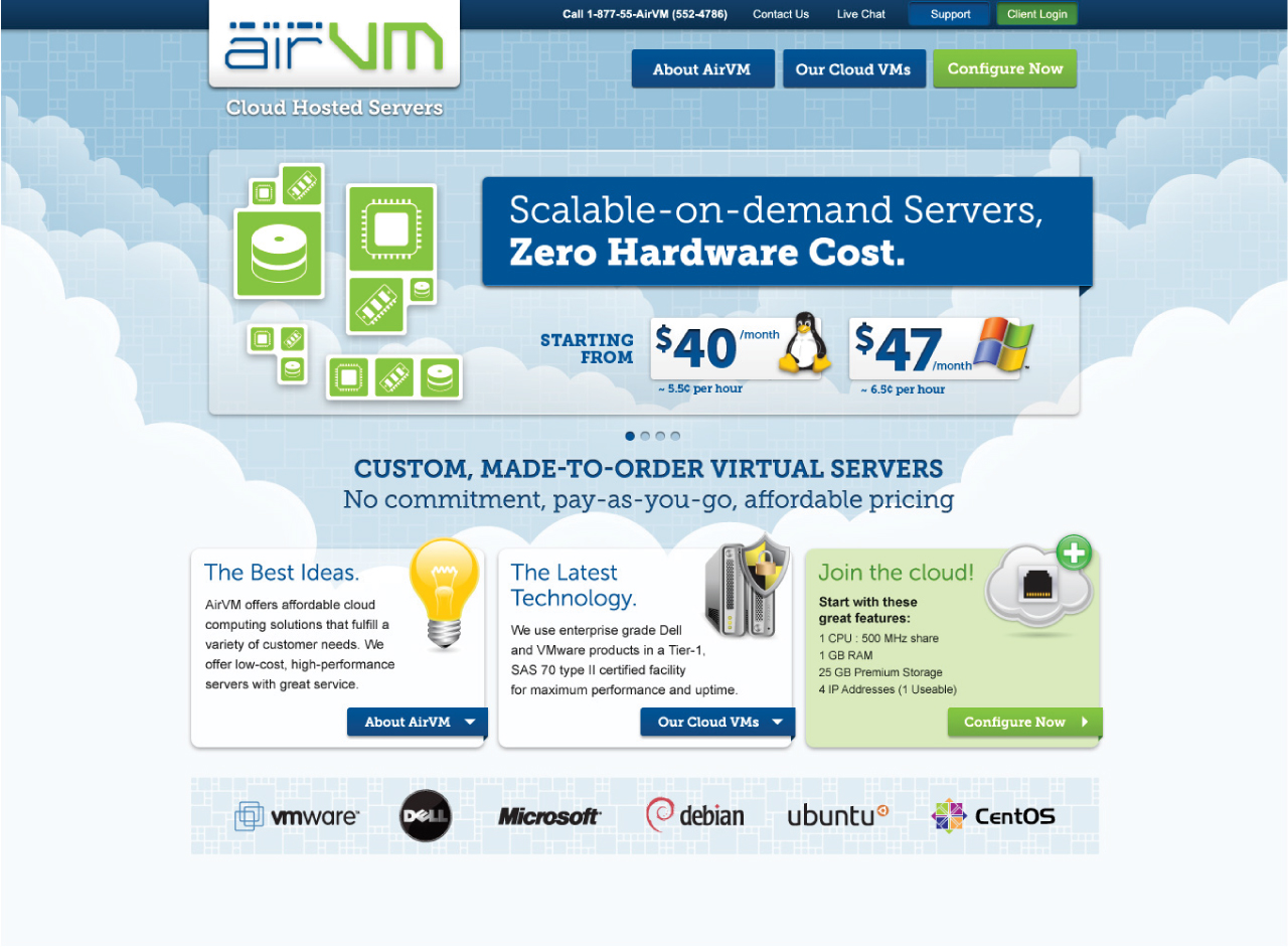
AirVM Website (2012)
Following a successful run as a vendor of cloud-hosted servers, AirVM shifted its business model to license its cloud management platform to resellers and service providers. In essence, the company moved from selling cloud services directly to offering the infrastructure for others to do so.
This pivot required substantial changes to the existing platform: introducing multi-tier user management, supporting branded storefronts, and accommodating the complex relationships between service providers, distributors, resellers, and clients.
The Challenge
Strategy/Methodology
Our team began by mapping the typical business structures within the cloud services ecosystem. Most followed a layered model:
-
A service provider owned the physical infrastructure
-
One or more distributors resold portions of that infrastructure
-
A network of resellers built offerings on top of that
-
And finally, end clients consumed the services
However, this structure wasn’t consistent. Some businesses operated without resellers, others skipped the distribution layer entirely. Our challenge was to design a system flexible enough to handle any combination of these tiers while maintaining clarity and usability for every role involved.
Process
Our UX process began with the creation of a comprehensive functional specification. We documented every action a user could perform, across every level of the system. Special attention was given to the unique capabilities and restrictions of each user type—resellers, for example, had tools for bundling and branding services, while end clients focused on consumption and management.
We then organized these capabilities into logical groupings, forming the foundation of a detailed information architecture. The final document resembled a large-scale site map, over 16 feet wide when printed, laying out the full breadth of the system. This became the blueprint for interface design and development.
Solution
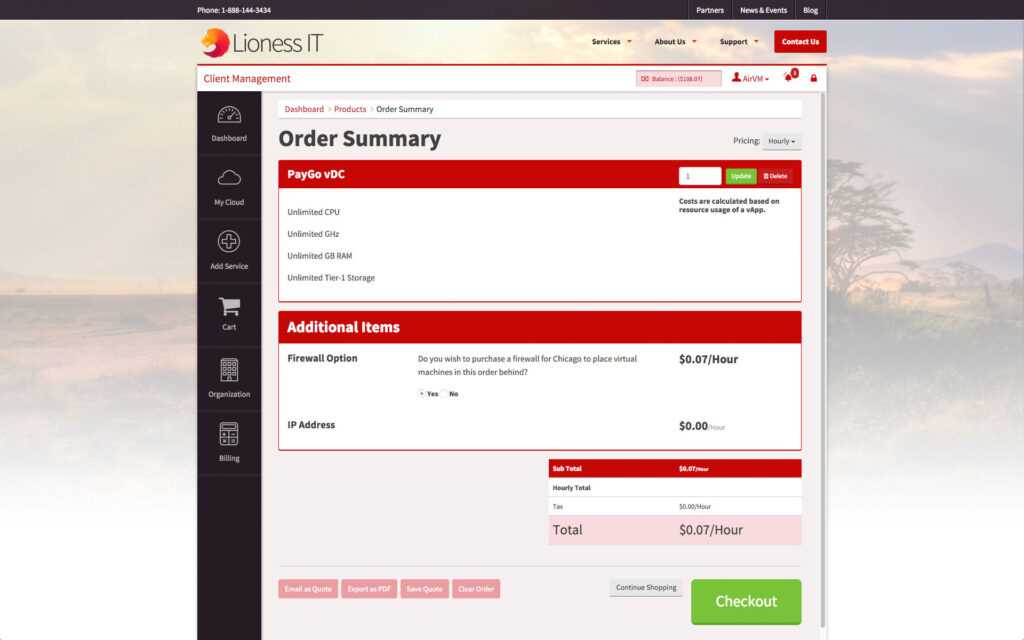
We designed a modular interface system that scaled with user complexity. Navigation was structured around three primary pillars—Resources, Operations, and Reports—with intuitive shortcuts to frequently accessed areas. The interface dynamically adapted based on user role, displaying only the tools and functions relevant to that specific tier in the service chain.
Importantly, the platform supported extensive white-labeling. Each storefront could be fully customized with its own branding, from logos and color schemes to fonts and even custom HTML/CSS overrides. This made it easy for resellers to present the platform as their own, maintaining consistency with their brand identity.

Results
The redesigned platform—eventually named AirSembly—received strong validation from both the industry and its users. It was named a finalist at TechCrunch Disrupt and won Best of VMworld for Public and Hybrid Cloud Technologies in 2014. By 2015, AirVM was valued at over $40 million, with the platform supporting hundreds of providers ranging from local IT firms to international enterprises.
User feedback consistently highlighted the clarity of the navigation and the utility of the customizable interface. As new modules were added, the underlying system proved resilient and scalable—proof that a thoughtful, modular UX foundation can evolve without sacrificing usability.
Additional Materials
Site Maps
Each ‘tier’ of customer had a very different way of organizing information and functionality.

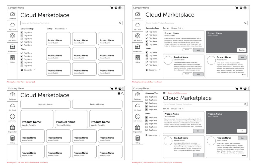
Wireframes
Rapidly iterating on many ideas allows us to work out key concepts and find out what works.

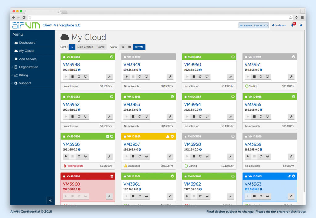
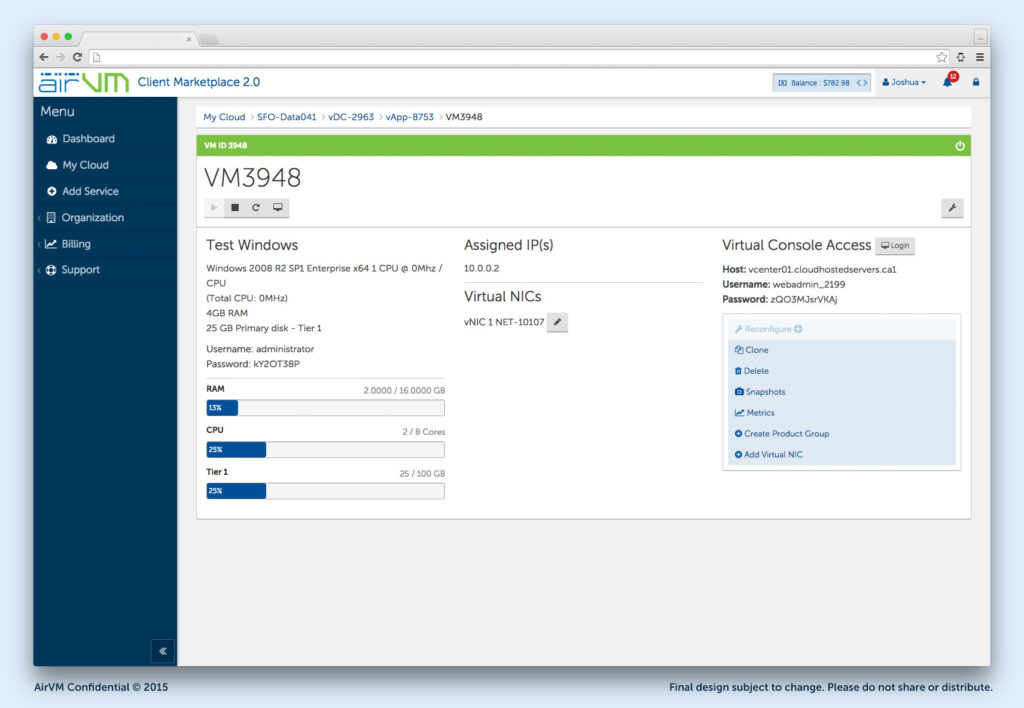
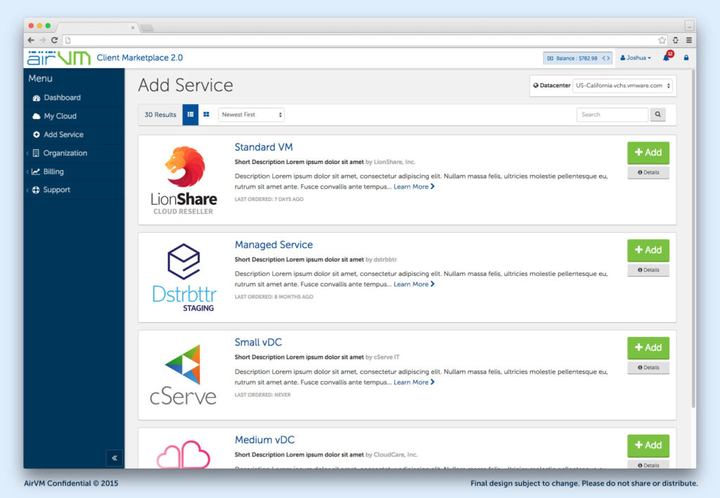
Product Screenshots
Key components of the platform included management and monitoring, so there was a lot of focus on dashboards and visualizing many servers on one screen.

Fully Brandable
With some basic HTML and CSS skills, the entire user interface could be customized to any branding.